
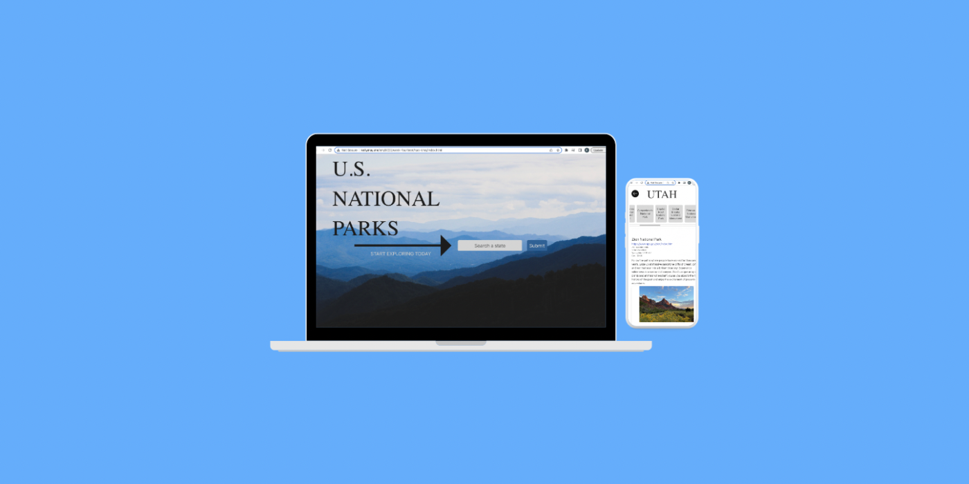
An interactive website detailing of all of the National Parks in the United States, built with HTML, CSS, Javascript, Bulma, and the parks API
Tools
Figma, Visual Studio Code, Git
Team
2 Designers
My Role
UX Designer, Web Developer
Duration
3 weeks (Fall 2022)
Project Overview
This project was originally handed over as a somewhat functional web page with minimal styling and features. It had a home page with a search bar and a state page of parks for each state. We began by aimed to improve the UI, functionality, and speed of the website. View the final project: here.
*Here is a video of the final outcome:
The Challenge
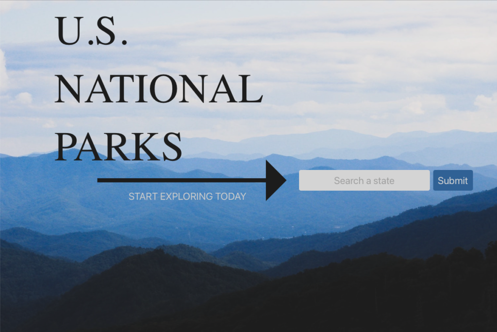
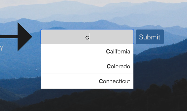
Starting with the original files, we had a lot to improve upon. First, the homepage was empty and bland, and the dropdown box was not displaying properly. Next, the second page displayed all of the park names at the top in a large grouping that was not easy to read nor navigate, and then had too large of images below the park names of each individual park with a “click here” button that would bring you to a page with just one really large image taking up the entire browser screen. The experience was unpleasant and disorganized. The typography, sizing , alignment, spacing, and information displayed was all scattered, gross, and dysfunctional.
*Here is a video of the original site and some images pointing out its flaws:


The Solution
Brand the site
We created a brand identity first, to establish a cohesive look and feel that will carry through to the website design. This includes choosing a color palette, typography, and visual elements that will be used consistently across the website. By doing so, the brand identity helps to establish a strong visual presence that will make the website more recognizable and memorable.
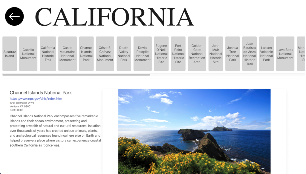
Optimally display state parks
By optimizing the display of the state parks, we created a positive user experience, improving readability, enhancing user engagement, and increasing accessibility.
Expand individual park details
Using the National Parks Service API, we included more detailed information for a more comprehensive overview of the parks, better educate users, establish credibility, and improve SEO.
The Design Process

Define
With our vision of the website, we aimed to fix the most pressing issues: the display of the homepage and the display and functionality of the second page, as well as having a more informative third page that includes park images and content from the park API. I found that we were having several issues bringing our design to life with proper functionality and styling. Some keys issues involved:
- styling the homepage with the buttons appropriately spaced and aligned, as well as the states that appear during an active search in the dropdown menu
- condensing the park information page with the desired amount of information with also providing all of the options for other resources and pages available to the user at all times
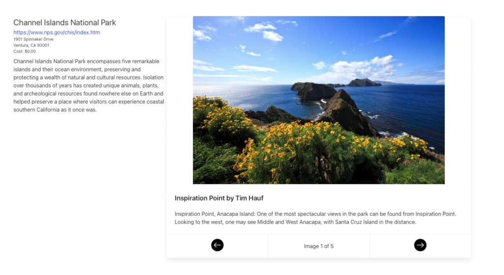
- displaying the individual park images in a smaller slideshow with its correlated description, park address, park hours, etc. using the API information
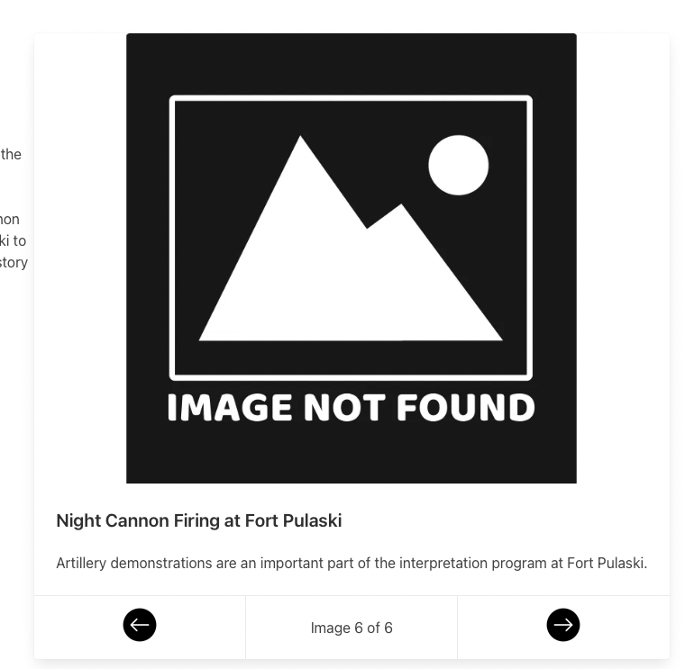
- proper functionality of the individual park images when clicking the new features: left and right arrows with corresponding image numbers, as well as what to do with images not found
- providing accessible (and easily seen and understood) features to navigate back and forth between states and parks
Ideate
We researched similar websites, including National Parks Service, National Park Foundation, and Seeker. Dissecting the parts we wanted to incorporate, we came up with some ideas of how to best implement them into the existing site.

+ add imagery to the home page
+ display state parks in a horizontal scrollview
+ detail individual park pages using APIs
Design
We transformed our sketches into the prototype using Figma. *Here is the first prototype:
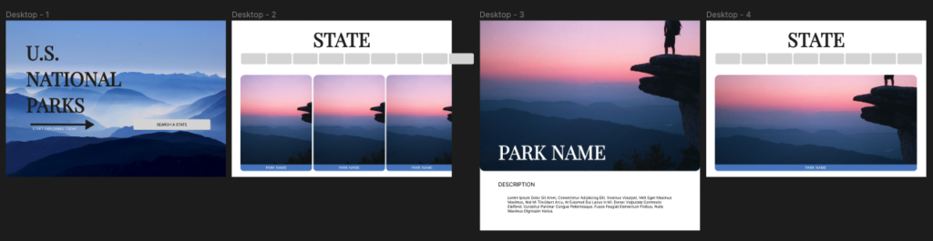
*Here are images of the final website:


Evaluate
With expert opinions and feedback, we developed several iterations. *These are the changes made from prototype to final product:
Homepage:
remained mostly similar in the final product, with a few spacing adjustments to account for the mobile view, so that the website can be more mobile responsive
Second page:
- visually removed the gray sliding boxes on the first view, as the park pictures + names below did the same job
- in the code, the boxes are still there, but hidden to the viewer, and they reappear when a user clicks on one park to view, so that they have the option of scrolling through other parks of the same state.
- added a back button to take a user back the the homepage without using the browser.
Third Page:
- included the same content and added more
- changed the layout and used a card feature from Bulma to organize the individual park information and slideshow to display the various images belonging to each park
Fourth Page:
- got rid of it; it made no sense to have this and the second page
We drifted from the original prototype to what we now call the final product. As far as development goes, my biggest solution was implementing the front-end development tool, Bulma. I used Bulma to apply styling to the html in a consistent format with the least amount of characters used. One thing I’ve learned throughout this process, is the less code the better. That means, the less code there is to read, the easier it is to understand. Another big learning point was when I decided to rename several classes, functions, ids, and sections. This cleaned up the code, so that I was better able to see what each function did when it had a name that related to its purpose.
On the homepage, I changed the input field to only have one field inside of a “get” method form, the “nps form”. It calls the nps html when the submit button is executed and it puts a JQuery string into action. It uses the name, state input, runs the action, and passes it the value inputed, such as “Georgia”. For the parks page, my classmate used the styling “display: flex” to have the park images scroll. I added a state park card to execute that function. By using hidden classes on the body content, I was able to hide the image buttons with the gray text buttons at the top. One of the most difficult features to set up was the footer of the card, containing the previous and next buttons. I used fetchData to get the status code, to see if we use the actual image provided in the API, or the “image not found” image to be shown. There were several features I learned to incorporate using new functions I discovered through other resources, such as Stack Overflow.
Results
I developed an interactive website detailing all 424 National Parks in the United States, using HTML, CSS, Javascript, Bulma, and the U.S. National Parks Service Data API. With the prototype created in Figma and several iterations, I improved the usability and functionality of the site. I redesigned the state pages with a horizontal scrollview with smaller images and larger titles, and I redesigned the individual state pages with a horizontal scrollview, adding a feature for users to continually browse state parks without having to start all over again after each search. This improves the user journey to be more efficient and aesthetically pleasing. Most notably, I called more data from the API to appear in an organized format on each park page. This enhances the user experience, as users may browse several images of a park as opposed to one, and continue their search of the park they are looking at with an extension to other sources of information.
I am very proud of how much I pushed myself to learn new concepts to reach a desired effect I had in mind. I am more familiar with researching concepts I’m looking to apply to my code and will be more prepared to take on new tasks in my next web development journey. For future project, I will look into applying Bulma to it, as I have learned how valuable it is. I am also more motivated to organize my code with proper naming and formatting. I am excited for my next endeavors, so I may fine-tune my new skills. I have linked the finished product below.
Project Website: here
