Researched, designed, and prototyped a solution to simplify group scheduling and automate meeting coordination, using an AI-driven chat feature to enhance efficiency and resolve calendar conflicts.
-60%
Reduction in time spent scheduling meetings
+80%
Improvement in user satisfaction with scheduling processes
+25%
Increase in meeting attendance rates
-70%
Reduction in scheduling conflicts
Role
Products
Duration
A common challenge for teams using Slack is finding a time to meet that works for everyone. The process typically involves several steps:
Reaching out to team members to ask for their availability
Waiting for them to respond with their available times
Picking a time that works for everyone
Scheduling the meeting
This back-and-forth process can become tedious, especially for distributed teams, remote workers, or groups with busy schedules.
How might we streamline this process to make scheduling faster and more efficient, especially in a remote or hybrid work environment?

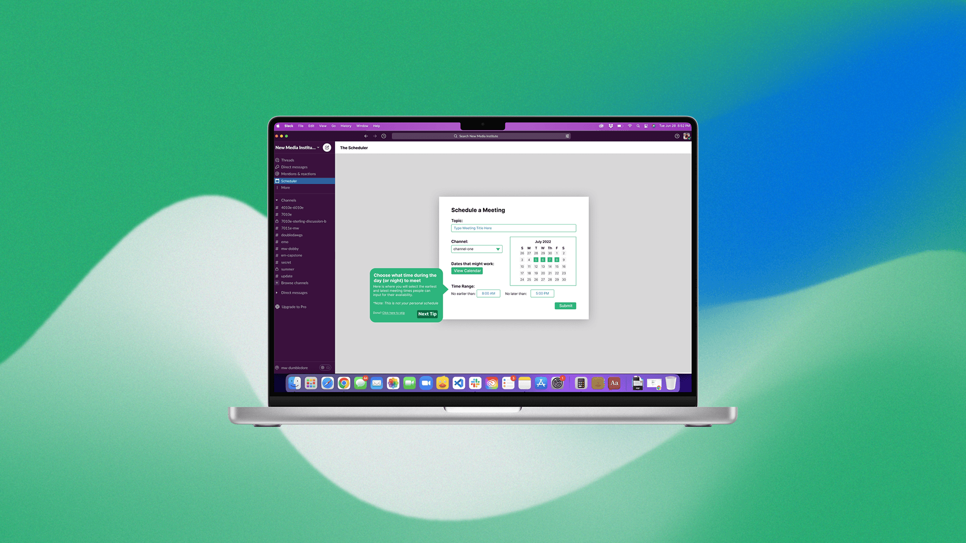
The Scheduler: We created a new Slack feature powered by an AI-driven Slackbot that automates meeting scheduling.
The Slackbot collects team members' availability, identifies overlapping slots, and suggests optimal meeting times, reducing manual coordination. This AI feature integrates seamlessly with Slack, making scheduling faster and easier for teams, especially in remote or fast-paced environments.
The design approach I adopted:
01
Research
Competitor Analysis
User Interviews
Journey Mapping
Internal Review
02
Define
Understand Problem
Define Project Goals
Expected Methods
03
Design
Sketch
Storyboard
Build Prototype
04
Evaluate
Conduct User Testing
Analyze Feedback
Refine Design
During the research phase, we focused on understanding the pain points of scheduling meetings within Slack, gathering insights from real users through interviews, surveys, and competitive analysis. This helped us identify the challenges teams face and how our solution could address those needs while fitting seamlessly within Slack’s existing interface.
Competitor Research: We analyzed existing scheduling tools to understand their strengths and weaknesses. This research revealed gaps in user experience, such as complexity and lack of integration with communication platforms. By learning from competitors, we could refine our feature to offer a more intuitive and embedded scheduling experience within Slack.


Journey Mapping: This journey map visualizes the user’s experience of scheduling meetings before and after using the Slack Scheduler. It helped us identify key pain points, emotional highs and lows, and opportunities for improvement. By mapping the user’s journey, we gained a deeper understanding of their needs, which informed our design decisions and ensured the feature aligned with user expectations.

The overarching goal was to design a user friendly feature to Slack that enables fast and easy scheduling information sharing. Broken down into 3 parts:
01
Streamline Scheduling UX

to ensure the brand message aligns with the target market
02
Integrate AI for Efficiency

to strengthen recognition and build trust across all channels
03

for improved engagement, clarity, and brand consistency
We created lightning demos and solution sketches to visualize the feature. The team voted on the best ideas, and I led the final decision-making process, integrating the most effective ideas into the prototype.
Lightning Demo: These were quick, low-fidelity concept sketches created to explore different approaches to solving the scheduling problem. This exercise allowed the team to rapidly test various ideas, narrowing down to the most promising solutions before committing to more detailed designs. The sketches provided a clear visual direction and ensured we were aligned on the key functionalities early in the process.

Storyboard: The storyboard visualized the user journey, outlining key interactions and pain points. It helped the team align on the flow of the Slack Scheduler and ensure a seamless, intuitive experience.

During this phase, we conducted user testing with five participants who had varying levels of experience with Slack. We observed their interactions with the prototype, gathered feedback on usability, and identified areas for improvement. This allowed us to refine the design and ensure the final product met user needs effectively.
User Testing: These notes capture key insights from user testing, highlighting pain points and feedback on the Slack Scheduler prototype. They were instrumental in fine-tuning the design, addressing usability issues, and enhancing the overall user experience.

By combining user-centered design with seamless integration into Slack, I created a feature that streamlined scheduling and boosted team collaboration. The Slack Scheduler simplifies meeting coordination, making it more efficient while maintaining a smooth, intuitive user experience—helping teams save time and increase productivity.
-60%
Reduction in time spent scheduling meetings
+80%
Improvement in user satisfaction with scheduling processes
+25%
Increase in meeting attendance rates
-70%
Reduction in scheduling conflicts
Aletha Health -Branding
Developing the brand identity, email campaigns, and marketing assets to strengthen brand presence, drive customer engagement, and boost conversions.